MyDoc mobile app
A real-client project that involve user experience design on a mobile application
UX techniques used in this project:
Competitive Analysis
Contextual Inquiry
High-Fidelity Prototyping
Organisation Analysis
Persona Crafting
User flow mapping
User Interview
Usability Testing
Project Brief
The students of UXDI were to utilise the knowledge of an UX designer to redesign the product of their assigned client, according to the client’s requirements.
Client assigned was:
MyDoc is a digital platform for healthcare communications and care management for medical providers and patients. Started in 2012, MyDoc is Predominantly a B-2-B application to manage insurance and HR claims between companies and their employees. And their goals for their app are as mentioned in the following:
Increase the level of user engagement on the app
Increase the level of user satisfaction on the app
Present a realistic and sustainable plan for future app growth and feature additions
Incorporate current app features such as the Pixi chatbot as much as possible within the new design
Improve the on-boarding experience of the app for new users
Project Scope
To come up with new design concept for the future MyDoc patient mobile application, transforming it from a predominantly telemedicine application into a holistic healthcare companion for users. This is to be done by integrating current and new features that will be incorporated into the new design of the application.
1) Primary scope
Improvement of the current online consultation flow
Improvement of the current on-boarding process
Addition of physical consultation booking feature
Redesigning the IA of the app and plan space for future app growth
2) Secondary scope
Addition of medication delivery and pickup feature
Designing a health dashboard: displaying biomarkers over time with subjective (questionnaires) and objective (IOT devices, lab results) data
UX Research
1) Competitive Analysis
As the idea of telehealth is widely popular in the world, MyDoc is bound to face competition in the industry. The following is a competitive analysis chart that comprises with the comparison that was done for MyDoc with the competitor apps selected based on their similarity to MyDoc. 3 of them are local/regional apps that feature telemedicine functions and 1 of them is an international app with telemedicine and chatbot functions.
2) Contextual Inquiry
Five users were initially invited for the contextual inquiry of the current app to determined its current functionality problems. They were selected based on their similarity to the proto-persona that we have crafted of a typical MyDoc user.
The following are the findings found from the contextual inquiry:
i) Users found that the simple and fast signing-up process is good. The usage of conventional and automatic change of input methods helps them to better understand and complete the process faster.
ii) All 5 users found the usage of terms like Group, Care Network, Asking a Health Question and others to be extremely misleading and confusing. This is because these terms do not mirror their other real world conventions.
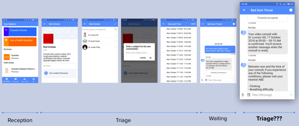
iii) Instead of helping user relate to the app, users end up questioning the current usage of the Chatbot because it is always mixed-up with other processes on the app like the Consultation of Doctor and Speaking to a Pharmacist process.
iv) Most users are skeptical of telemedicine and would prefer to consult a doctor physically because of the personal human touch. However, the app does not seem to have any processes that are familiar to the users.
v) Since, users have a trust issue with the usage of telemedicine, the current app should not be appearing as sterile, business-like, not friendly and not relatable. The apperance of the current app did not alleviate the trust issue.
3) User Interviews
Throughout the project, interviews with 5 more MyDoc current app users were also conducted to understand their views towards a healthcare app. This is to understand their expectations, aspirations, goals and needs that helps to determine design strategies for the future MyDoc App. The following are the what the users want a telemedicine mobile application to do for them:
Application as a smart and proactive healthcare companion not a reactive tool
A secure and accessible location to store all their healthcare history
An application that is easy to use because it mirrors their real world experience with healthcare
An application that fully integrates their offline and online processes
4) Synthesis
In summary, the following are the key findings that were found from the contextual inquiry of the current mobile application and the various user interviews. According to the reserarch, redesigning the mobile application is needed to increase the level of user engagement. This is because as the trust issues of telemedicine are alleviated, people will be more willing to use the service.
Paperless System
For an online application, they expect the whole service to be paperless which is not always the case in certain processes on MyDoc.
Integration of offline and online
Their offline health test results should be integrated with the online functions of the application to create a smarter application.
Quick and Smart
While users understand that offline process can be clumsy and slow, they expect all online processes has to be as fast and accurate. Steps should be taken to lessen steps and limit choices.
Speaking the human language
Users wants to feel like they are talking to a person and not a machine. This will aid in the establishing of trust. This is especially important in personal topics such as healthcare.
Step by step
All the processes should be presented to users in individual steps to aid them in completing their tasks.
Usage of pictorial elements
Icons aided users in understand how the different features on the app work.
Division of chat bot from processes
Taking the consultation flow outside the chat format makes the processes a lot easier to understand.
Less waiting time on the phone
Users do not like to wait on the phone, the waiting process should be designed for off-the-phone waiting.
Home: Clear next steps
Home screen to always provide clear next steps on what user can do within the app.
Smarter use of chat bot
Users feel like the chat bot can be useful but it just have to be used in a smarter way.
Mirror real world aids recall
Processes and terms should try to mirror their real world counterparts as much as possible to aid recall.
5) Problem statement + Solution statements + Core content strategy
Up to this point, the research results had showed what can be improved on the current MyDoc mobile application, and how these changes can be done.
- Problem statement -
Users are not having a positive experience on the current app because they found the app organisation difficult to understand and the processes overly convoluted to use.
This makes the overall app experience unfriendly, untrustworthy and not relatable to the real-world healthcare experience that they know and trust.
- Solution statement -
To improve user’s experience on the app, information presented to users are aimed to be made more understandable, simple and friendly.
Re-writing the copy, reorganising the information architecture (IA) and simplifying the user flows and processes through the app will be made.
- Core content strategy -
To increase user’s satisfaction and level of engagement with the application, a friendly, comprehensive and relevant experience would be provided, allowing them to complete all processes in a timely, confident and seamless manner.
6) User Persona
According to the research, the MyDoc mobile application is predominantly a B-2-B application. Hence, the users will be mainly working adults. Hence, a persona is crafted out to help guide in the design of the solution.
Conceptualisation and Iteration version 1
1) Idea - Redesign of the online consultation flow
From the research, the process of the online consultation with the doctor is found to be unfamiliar to the users. This is because although the online consulation flow is mirroring the real-life situation at the clinic to a certain extent, and the process is not at all logical.
Thus, to better mirror the real-life situation at the clinic, the contents were re-organised. And with the re-organisation of the contents, the process thereby became much more logical and familiar to the users.
2) Idea - Integration of chat bot
According to the research users participants, a chat bot is supposed to help the users when they had a problem, though they do not mind any form of directing via a chatbot. However, in the current app, the chatbot is always involved in other processes in the form of chat messages which confuses the users.
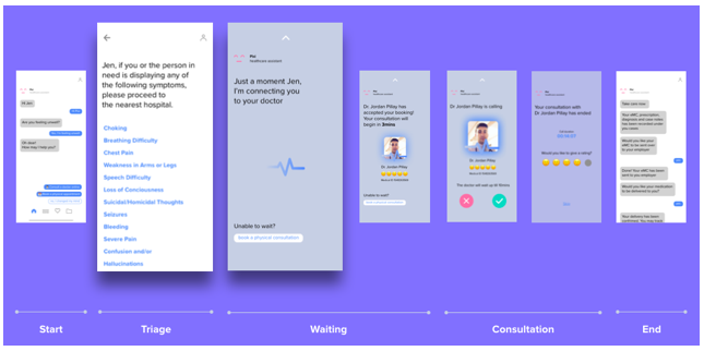
Hence, eliminating the chat bot in the form of chat messages might be better to avoid any confusion.
3) Idea - Archive of consultation cases and documents
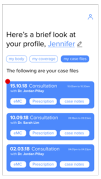
For users to find their consultation documents in the current Mydoc mobile application, they have to find the documents in the chat conversation they had with the doctor/pharmacist. Through the contextual inquiry, this process was found to be not intuitive to the users as they do not expect to find their documents in a chat. Thus, a navigation tab “Case Files” was designed for users to access their medical documents e.g. Electronic Medical Certificates, Prescriptions and Diagnosis.
4) Usability Test Responses
Generally, the users were quite satisfied with using version 1 of the designed prototype. However they had some recommendations to make the prototype even more user-friendly.
Users would like to see more details about the doctor they will be consulting at a glance
- Lessons learnt -
Just by making the online consultation process logical, does not really increase the trust level users have for the telemedicine service.
Users would like to access their documents in lesser clicks
- Lessons learnt -
Designing the access of the consultation documents to be intuitive to the users is not enough, users would prefer the app to be more proactive.
5) Clients feedback
Client are happy with the changes made to the first prototype. However, they would prefer to have a higher level of engagement via the chat bot as the chat bot is the main differentiation of the app with other similar local apps. The client would also like to to have designs that could integrate with future features.
Conceptualisation and Iteration version 2
1) Changes made based on feedbacks from 1st iteration
Users would like to see more details about the doctor they will be consulting at a glance
To make the redesgned mobile application more user-friendly, a new page was designed to include the details of the doctor the user would be consulting. This page would be displayed after the user had chosen a doctor from a list of available doctors, as a confirmation of choice before consultation.
Users would like to access their documents in lesser clicks
Combining the insights found, the documents options was then designed on the landing of the “Case Files” navigation tabs. Through this design, the users will be able to access their documents in lesser clicks. And they will be able to see the documents they had from each consultation at a glance too.
Client would like to see a higher level of engagement via the chat bot
Client would like to see more integration of future features
Since the client wanted more integration of their future features in the design, the chat bot was integrated as a menu in the landing page to provide features as options to the users. By doing so, users would be able to view their options all in a glance. And therefore the users would not be lost and would know where to click to go to the feature they desire.
2) Idea - Automatic submission of E-MCs to HR
The responses from the usability testing for the first version of the prototype was really helpful as they gave us more insights to what the users expects in a telemedicine app. One of them is the proactiveness of the app. Hence, the app was thought to serve the users better if it could submit the user’s E-MC straight to the employer on their behalf. This way, users can have more time to rest since they have one less issue to worry about.
3) Idea - Choice of doctor sorting
Besides just submitting the E-MCs on the users’ behalf, if the doctors could be appointed automatically upon request, users could get a consultation much more efficiently. As the value of telemedicine is to reduce the waiting time for a doctor consultation, which matches the users’ desire of a proactive app, the automatic appointment of doctor upon request was thought to be a good idea. However, remembering the response of users wanting to see the details of their doctor before consultation, some users may still prefer to choose their own doctors. Hence, users will be given a choice of choosing their own doctor for consultation or a random appointment.
4) Usability Test Responses
Due to mismatch of time availability, version 2 of our prototype was not shown to the clients. But to make sure only the best design was presented, an usability testing for prototype version 2. was conducted And based on the responses, the relevant changes will be made before presenting to the client the 3rd version of the prototype.
What users like about prototype version 2
Most users mentioned they felt that the order of screens to include the screen for displaying the doctors’ details were appropriate
Users generally like the option of random appointment of doctor for consultation as their waiting time could be shorter
What users dislike about prototype version 2
Users were confused with the usage of the icons for the various medical documents
Many users preferred to have a greater spacing between the menu options
Most users would prefer not to have their E-MCs submitted automatically by the app although some users liked that feature
Conceptualisation and Iteration version 3
1) Changes made based on feedbacks from 2nd iteration
Users were confused with the usage of the icons for the various medical documents
From the 2nd usability test’s responses, the realisation of not everything should be expressed through the usage of icons was found. Hence, to rectify, the medical documents representation icons were changed to wordings instead to avoid any confusion.
Many users preferred to have a greater spacing between the menu options
Since many users find the menu options presented in version 2 prototype not user-friendly, and as an user-centric user experience designers the design was ditched willingly. As such, the idea of a Med Kit was born whereby the users are able to find most services that that app provides in there. As for the main page, the chat bot will still be available to provide directions.
Most users would prefer not to have their E-MCs submitted automatically by the app although some users liked that feature
As some users shared that they are more comfortable to be in control of what their employers know about them, users will be given given the choice for the app to send E-MCs on their behalf.
Users generally like the option of random appointment of doctor for consultation as their waiting time could be shorter
Based on the responses from the usability test participats, more people prefer to have the automatic appointment of doctor. According to their explaination, if users were to choose a preferred doctor, they would have gone down to their preferred clinic. Hence, by using the MyDoc application, they would be wanting to consult a doctor in the shortest time possible. Thus, the online consultation process was then designed to have the users to be assigned to the next available doctor.
2) Idea - Statistics and Pixi reminders
After making the respective changes to the app, thoughts were given to have more opportunities on how the app could be more proactive than it is. And that is when the idea of Pixi being more than just a healthcare assistant, rather as a healthcare companion was born. So the MyDoc mobile application could not only provide health care reminders, the mobile application could also be smart enough to provide details of the users’ health conditions.
3) Idea - Onboarding process
To enable the mobile app to be smart enough to provide user’s health details, there should be a certain data input for the backend analytics to analyze. As the MyDoc app is predominantly a B-2-B mobile application, the users will be having their annual health check-ups with the medical partners of MyDoc. Thus during onboarding, the mobile application could be linked up to the account in the database and the analysis would likely be possible.
4) Usability Test Responses
Most users were pleasantly surprised with the 3rd version prototype when presented during the usability testing. But despite liking what had been designed, they do gave some questions to ponder upon for the improvement of the final prototype.
As the mobile application would be showing reminders and would be able to analyze the various health data, could it do more as a healthcare companion?
- Changes made to the final prototype -
In the final prototype, there will another feature called “Pixi Tips” which would be giving the user recommendations on how he/she could do to improve on their health.
Since the mobile app would be a repository of most health data which are private information, would there by any form of privacy measures available?
- Changes made to the final prototype -
Understanding the high level of risk information in a mobile phone is, password would be enquiried for access to personal health documents and data.
5) Clients feedback
Client are very satisfied with the prototype version 3 and had acknowledged the results gathered from the past 3 usability tests. They were presented with the final prototype too at the end of the project duration. And were delighted to use the new ideas presented in their new design of the app.


